Assignment #6: Week 4/6 to 4/20
Building Menu Hi-Fi
My main task for this week was to implement the hi-fi version of the building menu. This was a tricky experience because it was a rather crowded menu, with a few different things going on.
One particular issue I had was that the button that is selected is supposed to “flip” when its clicked. This was interesting to implement, and it definitely took me a bit of time to fix issues (like disappearing the button when clicked, having both the flipped and unflipped appear at once, etc.). Fixing this issue was very satisfying, and I love the effect that it had when completed.
What the building menu is supposed to look like according to the Figma.
The finished building menu.
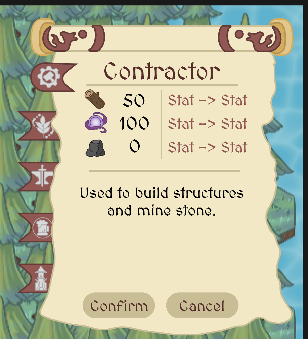
Fixing Smithy Hi-Fi Implementation
I also received feedback that my smithy hi-fi implementation wasn’t exactly correct. I was supposed to add a scroll feature where you could select from a list of objects, and then after clicking on a specific object, you will be taken to more details about that item. What I had previously was that there was no scroll at the beginning, it just went to some blank item.
Adding this feature was actually a bit difficult because it required quite a bit of code and changes to the functionality of the buttons. However, this was a lot of fun and a great learning experience because I got the chance to go back and see how I/others had implemented the smithy functionality.
The corrected smithy menu.
Merge Requests and Bug Fixes
After I got approval from the studio director that everything looked good, I decided to merge two of my branches into main. These included the hi-fi implementations for the main HUD, the building menu, and the smithy.
This was a lot smoother of a process because I had kept in mind my previous struggles with merging. I did have a bit of trouble merging the branch that contained the implementation for the main HUD, but I was able to figure it out after a bit of experimenting.
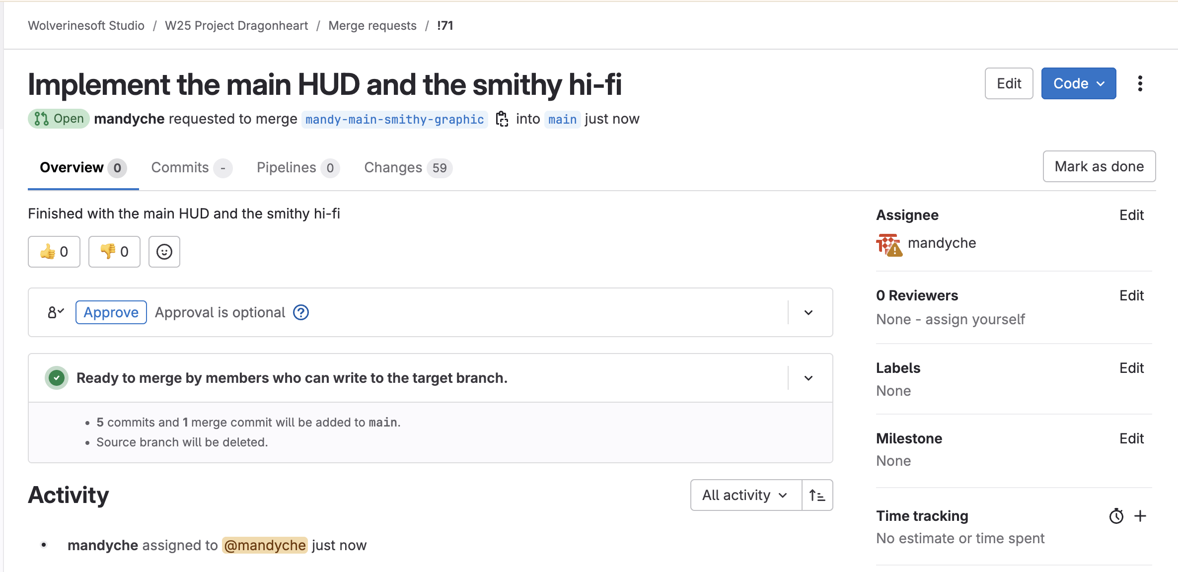
One of the merge requests that I made.
Before merging, when I was looking over my branches, I noticed that there was a bug in the building menu. When I selected an item and cancelled, and I reclicked the menu, that option would still be “selected” even though it shouldn’t be. I went through my code and fixed it, and now, the menu works as it should. I made sure to bundle this with the rest of the branch, so a correct implementation would be merged.
The bug where the building tab stays selected after closing the menu and reclicking.
I also received feedback to implement a progress bar for the smithy UI, and I added that feature as well. This was a bit tricky to figure out because I had to decide how I wanted to make sure that the progress bar stayed within its “container,” and once I figured that out, I had to make sure that I enabled/disabled the progress bar at the right place, etc.
Working smithy progress bar.
There were also some small issues like updating some PNG files with a higher quality version, and I dedicated some time to making sure that was seamless as well.
Disable Zoom Within Menus
One thing that I discussed with the studio director was that after implementing the scroll bar for the smithy, whenever a player scrolls, it would trigger the zoom in and out in the background. I was able to fix this by making it so that the zoom only occurs when the smithy menu was closed.
Zoom is disabled when smithy menu is open.
I also expanded on this and disabled the zoom in/out feature for almost all menus. An exception to this was the building menu because I wanted the user to be able to move around/zoom in/out to look at what buildings were currently placed, etc.
GDC Video
I wanted to do a bit of research into the game development industry, and I watched the video “‘Magic: the Gathering’: 20 Years, 20 Lessons Learned” from GDC. I learned a lot of extremely interesting lessons from the talk. I think one of the most interesting lessons was his first lesson about not going against human nature. When people want to do something, let them (within reason)! This is especially important in UI/UX, what I was working on throughout the project. Menus should be intuitive, and I can see the fact that human behavior is put at the forefront for the Figma designs that I eventually implemented.
Conclusions
I think one of the lessons that I learned throughout my time implementing Project DragonHeart is that I should make sure that I put more emphasis on having clean, understandable, and high quality code over something that just works. This is even more important when working in a team setting like I was in WolverineSoft Studio. Being a part of the studio and undergoing code reviews and the merging process helped me learn a lot about how coding in a team works, and I believe this is one of the most valuable skills I can have.
Hours Breakdown
- Meeting: 4 hours
- Building menu hi-fi: 6 hours
- Fix smithy menu, add scroll feature: 4 hours
- Merge requests and bug fixes: 5 hours
- No scroll when menus are open: 4 hours
- Watch GDC Video: 1 hour
Total: 24 hours