Assignment #2: Week 2/9 to 2/23
Escape Key Bug
During the meeting on 2/9, I reviewed the changes that I had made for the building menu with the studio director. For the most part, I received positive feedback, and I was glad to see that the changes that I was making were aligned with the direction that the team wanted.
However, I recieved a few requests about changes I should make to my implementation. The first task was to make it so that only one building would be placed when it is selected to be built. Previously, after going into “build mode,” the building that was selected would be placed continuously until the user turned it off. Therefore, I went into the code and modified it so that only one building would be placed and then the “build mode” would be turned off.
The other task was to make it so that after pressing the Esc key, the building menu would close. However, this ended up being an extremely difficult task. I really struggled with implementing this feature because the pause menu would also show up whenever I pressed Esc. The intended goal was to make it so that the building menu would close, and if there were no menus open, then the Esc key would pause the game. However, even though I tried multiple methods of implementing this, none were working.
Finally, I was able to get the Esc key behavior to work as intended by going into the files that directly controlled the pause menu and adding a GameObject serialized field to detect whether the menu was open or not. In hindsight, that seemed like the most appropriate course of action, but I was trying to do the detection within the handling of the building menu to keep the code as streamlined and separated as possible, which ended up not working because of the timing of the deactivation and the key press.
Smithy UI/UX Implementation
Originally, the UI/UX for the smithy building did not match the intended result. Therefore, my main task throughout the week was to modify the existing smithy interface to more closely match the implementation in the Figma file shown below.
 Figma for the smithy UI/UX.
At first, I ran into a hurdle because I had began implementing the smithy inteface from scratch, and I hadn’t realized that there was already a smithy interface that had a few of the functionalities implemented. Therefore, once I was finished implementing the design of the smithy interface, I had to go in and redo the implementation by taking some of the implementation from the previously implemented smithy interface.
It was also difficult to exactly identify what the previously implemented smithy interface mapped to exactly, but I made educated assumptions based on what I thought was most easily navigable for the user. Since I wasn’t implementing the smithy interface from scratch, it was a bit difficult to go through the code and understand how to apply it to the new design. However, I was ultimately able to create a project that I was very happy with.
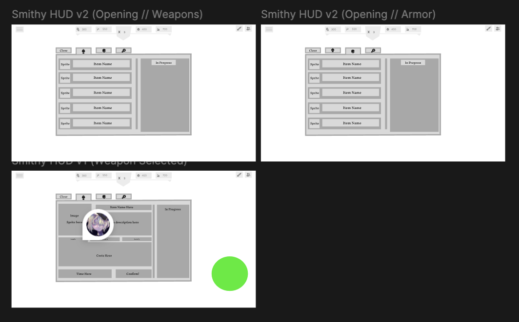
The finished smithy interface.
Ultimately, I was very satisfied with the way that I implemented the smithy interface. However, I plan to clarify what the interface is meant to look like when an item is finished, and what the “collect” button should look like. Currently, the Figma does not clarify what the “In Progress” section should look like when in action, so I would like to ensure that it matches the final vision.
Tavern UI/UX Implementation
The following week, my primary task was to modify the tavern interface so that it more closely matched the UI/UX in the Figma file. Once again, the intended end result is shown below.
 Figma for the smithy UI/UX.
The tavern interface had a lot of small details that needed to be changed for the final implementation, which made it a bit more tedious than the smithy interface. Additionally, it was difficult to figure out how to exactly map the implementation from the Figma onto the game itself, since how things like the “stats” were meant to be displayed were a bit ambiguous.
It was also tricky to understand what the previous implementation was doing with the code. There was something interesting where multiple buttons were “stacked” on top of each other and would replace the other as one was clicked. I thought this was an interesting way of implementing a change in the button function, but it made it a bit difficult to understand what was going on at first.
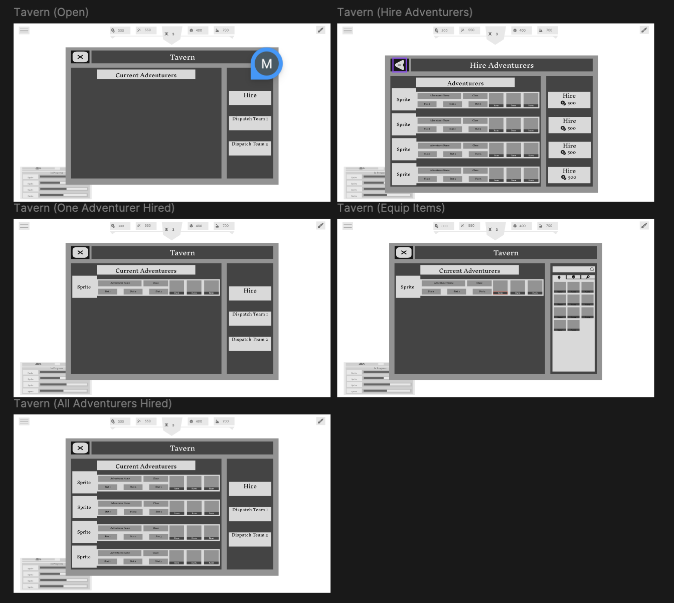
The finished tavern interface.
I am satisfied with the way that the tavern interface ended up. I think that its in game interpretation matches closely with the way that it is depicted in the Figma. There are a few details like how exactly the statistics on the bottom of each adventurer row should be best depicted that I intend to clarify, but aside from that, I think that the improvement has been significant.
Research Prefabs
In my journey in modifying and implementing these interfaces, I realized that I was not sure what a “prefab” was in Unity. Therefore, I made sure to pause my progress to make sure that I understood what it was and how it was being utilized in the project. This was very interesting to me, and it made me realize why certain things were implemented the way that they were.
I noticed that modifying the prefabs directly made modifying the previous implementation a bit simpler, since modifying a prefab meant that other copies would be modified as well. Therefore, things like color, shape, and size were easier to uniformly modify. This was a significant improvement from individually modifying each item, and it would also make adding or removing more copies of this item easier as well.
Conclusions
I think one strategy that I definitely want to implement in the future is to take the time to understand why something doesn’t work rather than charging ahead and iterating on one idea. For example, when I was struggling to figure out why pressing the Esc key would both close the building menu and bring up the pause menu, I didn’t take the time to think about the timing of when one GameObject was deactivated (what I was using to detect the menu being open). By moving the check of whether the menu was active or not, I fixed the problem, but not before I sank a lot of time into debugging and pushing forward on my attempts to keep the check where it was.
Additionally, another useful strategy would be to make sure that I understand every feature that Unity has to offer as I come across them. I had seen prefabs before, but I had sort of shrugged them off. In the future, I definitely want to make sure that I understand why they are there because it will often make my own coding a lot easier and also more reusable and in “good form.”
Hours Breakdown
- Meetings: 4 hours
- Escape key debugging: 2 hours
- Implementing design to smithy: 4 hours
- Adding feature and functionality to smithy: 5 hours
- Implementing design and function to tavern: 8 hours
- Playtesting the game and researching: 2 hours
Total: 25 hours