Assignment #1: Week 1/26 to 2/9
Background
I was assigned to the UI/UX team as a programmer, and because the plans for the user interface have not been solidified yet, I worked on creating a temporary menu for buttons and interactions in order to practice techniques and create an aesthetically pleasing experience.
The main tasks I was assigned were:
- Add a button that brings up the build menu.
- Add buttons that show up when the player selects a building.
- Create animations for the buttons and overall interface.
Prior to this sprint, I had added the button to bring up the build menu, created a flashing effect when a building was selected, and added buttons that would show up when a building was selected.
Video of state of UI/UX before this sprint.
This had worked relatively well so far, but I would have to make various changes in this sprint.
Adding Animations
In this sprint, I wanted to add an animation that would play after the building was deselected. Similar to how the buttons “rose up” into frame, I wanted the buttons to “sink down” out of frame when the building was deselected. However, because of the way I had coded the animation, I would deactivate the panel before the animation could play, therefore making it impossible for the animation to play.
I tried several methods to try to mimic the way that I had created the opening animation in order to create the closing animation. However, I could not seem to way to make the closing animation play before the buttons deactivated in a way that was streamlined and would be easy to maintain. I also realized that the way that I had created the opening animation was clunky and would be hard to edit if the team decided on a different animation for opening/closing. Therefore, I decided to switch tactics and find an alternative method of creating animations.
I decided to turn off the animations that I had made previously, and use the built in animator in Unity. At first, I was struggling to use the animator because I had very little exposure to it. However, after watching a few videos online and realizing the slight nuances to it, I was able to create an Open and Close animation. Because I used the Unity animator, it would also be easy to edit if further changes needed to be made.
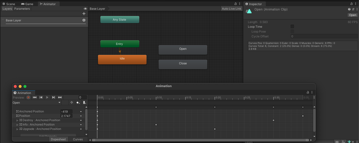 Screenshot of Unity animator for Open animation.
Another important action to animate was interactions with buttons. The buttons were using the Unity default animation of shading when being hovered/clicked. However, I needed to add a “shrinking” animation in order to make the entire interface “bouncier.” This would not only make the interface seem more alive, but it would also add more polish to the product.
At first, I wasn’t sure how I would implement this animation. I could go the route that I had for creating the flashing during selection, and create a method that I attached to every button. I could also create an animator like I did with the Open and Close animations. However, I recognized that this would be tedious to add to existing buttons and any new button that was added would have to have this script attached as well. Furthermore, it would be very easy for me or another programmer to just miss a button.
Therefore, I implemented a class called GlobalButtonHover. This class would find all buttons (active and inactive) and add the hover effect as a component automatically. This solved the issue of tracking down all the buttons and adding this component to them. The implementation of the animation involved shrinking/resizing the buttons, and it was able to work effectively afterwards.
Video of animations in UI/UX.
Adding Function
After adding the cosmetics to the buttons and menus, I also needed to add functionality to the buttons that I created. More specifically, I needed the Info, Upgrade, and Destroy buttons to do what they each specified.
For Info, I was not given clear specifications as to what should pop up in the event that it is pressed. I decided that I would use this button as what should be pressed in order to get the default select behavior that was occurring previously. For example, when the Tavern was selected, a popup would automatically appear. However, I changed it so the Info button needed to be pressed first.
For Upgrade and Destroy, I was fortunate that there were existing methods that I could invoke in order to properly upgrade and destroy the selected building. However, it was difficult to track down and locate the specific methods needed because they were so intertwined with other pieces of code. Fortunately, I was able to figure out exactly what needed to be called in order to properly handle these two scenarios.
Video of button functionality.
Finalized Implementations
Later on, the designs for the UI/UX were finalized, and I was assigned to recreate the Figma file that outlined what the finalized UI/UX interface should look like. We decided to split up the work, and I would work on implementing the build menu and the resources header.
 The Figma file I would be reimplementing.
Resources Header
The resource header was mostly a cosmetic overhaul. The functionality remained relatively similar to before, but all of the sprites had to be changed and moved to match the Figma file. While this seemed relatively simple at first, there were a lot of small nuances that came up that made the process more difficult.
First, the Fossil resource was oddly spaced from the other resources. Therefore, it was impossible to use a Horizontal Layout component to create a consistent and even spacing. I calculated the locations that each item in the header should be, and had to do a lot of minor shifting to more closely match the Figma file.
Next, the text was difficult to deal with. At first, I was changing the font size and position, but I realized that the issue was actually that the textboxes weren’t lining up properly anymore. So, I went through and adjusted the boxes to stay within a certain area on their designated resource header to ensure that the text stayed neat and readable.
Furthermore, I had to change the anchor points so that as the screen changed sizes, the header would still be visible and not overlap anything important or go off the screen entirely.
This process was time consuming because it involved a lot of tiny shifts and edits to things like font size, position, colors, etc. to make it match the Figma file as closely as possible.
Building Menu
Creating the building menu was far more difficult than I anticapated. I had previously assumed it would be similar to the resources header, where it was mostly a cosmetic replacement, but there were a lot of small differences that I added/removed for ease of use. There were also a lot of strange issues that arose that were not present in the previous implementation.
The first bug that arose was that the default image would show up when opening the build menu. This was not preferred because the building could not be placed, and it shouldn’t be an option at all. I tried to figure out workarounds including triggering the contractor building to be the default when opening the menu, but I decided that instead, I would disable where it showed the building information and enable it when something actually buildable was clicked instead. This was more similar to how the previous implementation worked and was more immediately understandable.
There was another bug that arose when I tried to implement disabling the build option. I wanted to make it so that when you clicked the build menu button again, it would remove the edit mode so the player was no longer placing buildings. The way I implemented it would make it so that only the internal cancel button would disable it, which was not what I wanted. I realized that the reason why I wasn’t able to turn it off by directly pressing on the build menu button again was because I was mismanaging states. Therefore, I fixed how I managed the states and was able to make the buttons function how I intended.
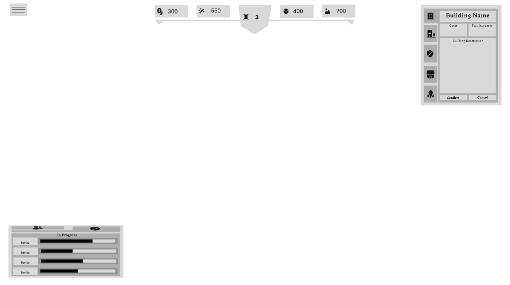
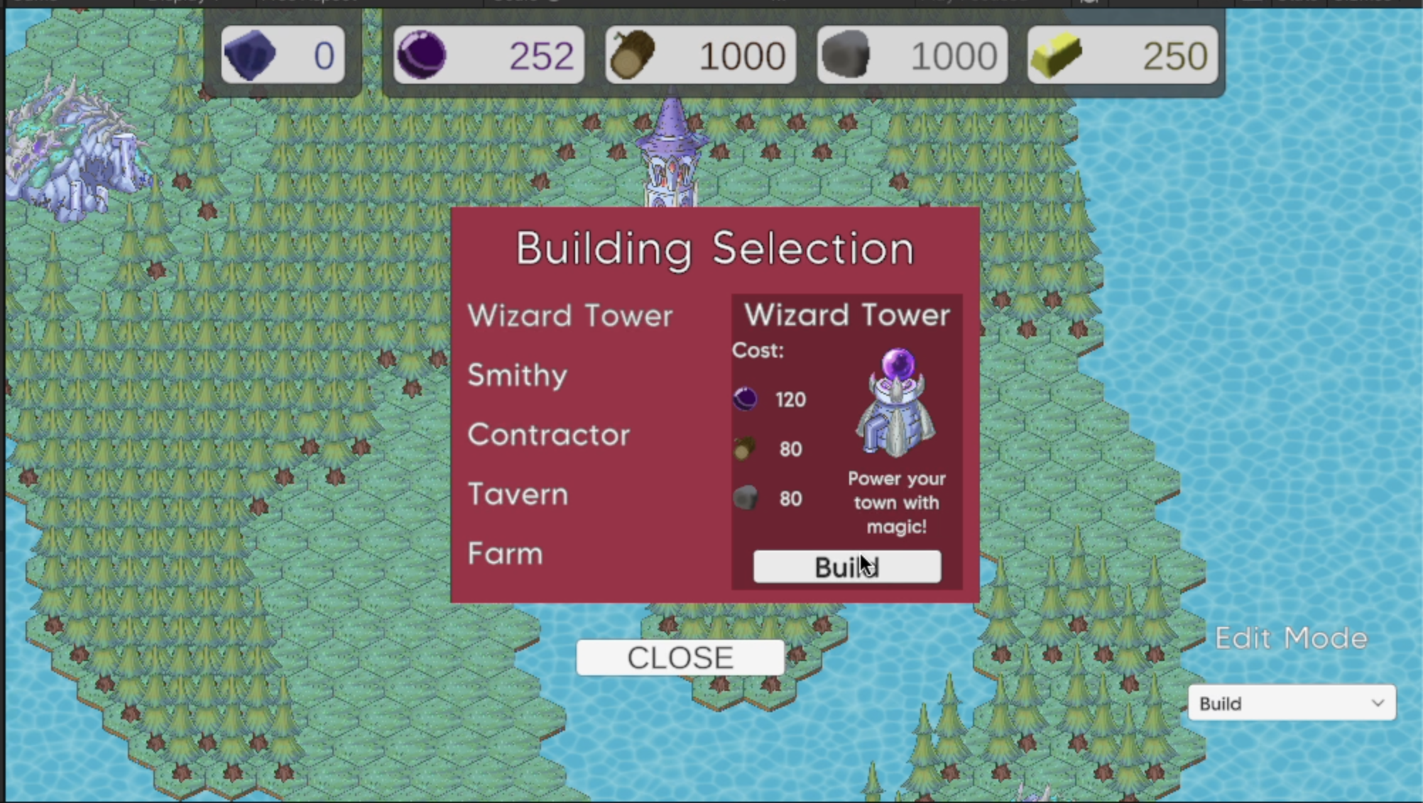 What the previous build menu looked like.
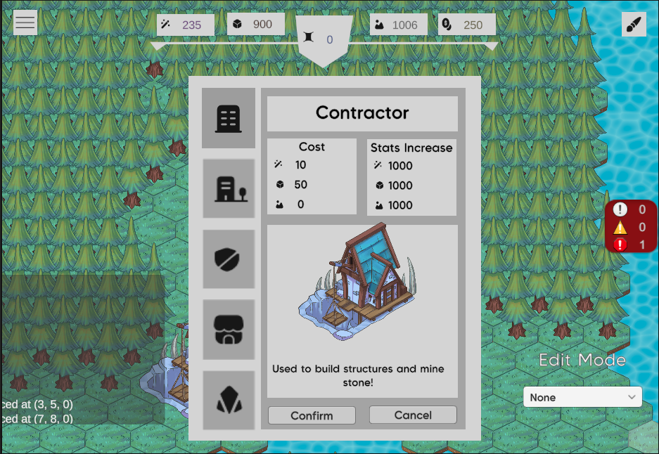 What the build menu currently looks like.
Video showing the usability of the build button and building menu.
Conclusions
The time management strategies I used was working in long blocks of time. This helped get a lot done because I was able to enter a “zone” as I was working. Furthermore, because I didn’t interrupt my work sessions for long periods of time, I didn’t have to spend as much time thinking about what I did previously and what I needed to now accomplish.
In the future, I think a good strategy would be to not sink too much time into something that isn’t quite working out, especially if it is something that doesn’t seem maintainable and if strange and awkward work arounds are needed to get it to work. This would help to keep progress moving forwards versus sinking time into something fruitless.
Hours Breakdown
- Meetings: 4 hours
- Editing previous animation implementation: 3.5 hours
- Overhauling animations, creating more animations: 5 hours
- Adding button functionality: 2 hours
- Resources header: 3 hours
- Building menu: 4 hours
- Testing functionality: 3 hours
Total: 24.5 hours